Showing posts with label maps. Show all posts

Monday, March 03, 2014

From Kiev to Crimea is about the same as from New York to ?

The Russians have moved into the Crimean Peninsula, but I'm guessing only about two or three Americans out of a thousand could point to Crimea on a map.  So here's a post to raise those numbers.

First, here's a map of Europe with Ukraine in the black box.

Basic map from Infoplease
The black square is enlarged below, with the Crimean Peninsula highlighted in the black box. 


Just to get a sense of things, Kiev is about 430* air miles from Sevastapol.  Here are some other cities that are about the same distance apart.


Paris to Munich
New York to Detroit
Mumbai to Bhopal
St. Louis to Ann Arbor
Hanoi to Chiengmai
Seattle to Calgary*

I understand that Russia's action is a big deal.  But it's also, apparently, a common event in this region.  From Wikipedia:
Crimea, or the Crimean Peninsula, located on the northern coast of the Black Sea, currently under the jurisdiction of Ukraine, has a history of over 2000 years. The territory has been conquered and controlled many times throughout this history. The Cimmerians, Greeks, Scythians, Goths, Huns, Bulgars, Khazars, the state of Kievan Rus', Byzantine Greeks, Kipchaks, Ottoman Turks, Golden Horde Tatars and the Mongols all controlled Crimea in its early history. In the 13th century, it was partly controlled by the Venetians and by the Genovese; they were followed by the Crimean Khanate and the Ottoman Empire in the 15th to 18th centuries, the Russian Empire in the 18th to 20th centuries, the Russian Soviet Federative Socialist Republic and later the Ukrainian Soviet Socialist Republic within the Soviet Union. In 1991 it became part of independent Ukraine, as the Autonomous Republic Crimea.
And while there will be calls for the US President to take decisive action, it makes sense to look at the geography of the Crimean Peninsula first.  It's almost inside Russia. It's as close as Mexico to the US.  You know how the US would respond to a military incursion by Russia or China in Mexico.  Russians will respond the same way.  Realistically, there's not a lot we can do militarily that wouldn't cause far more harm than doing nothing.  (But then Iraq and Afghanistan are distant memories for many.)  Our response will have to be patient and more nuanced than missiles and bombs.  First we should look at maps and maybe read some history.  Diplomacy and economics will be far more effective weapons in the long term. 

We tend to remember a place first by our own involvement in it.  If Americans know anything about the region, it's from Yalta and from the Crimean War, whose lasting legacies through the English to the US, include  Florence Nightingale,  and the Charge of the Light Brigade, a terrible debacle for the British.

The Charge Of The Light Brigade
by Alfred, Lord Tennyson
Memorializing Events in the Battle of Balaclava, October 25, 1854
Written 1854


Half a league half a league,
Half a league onward,
All in the valley of Death
Rode the six hundred:
'Forward, the Light Brigade!
Charge for the guns' he said:
Into the valley of Death
Rode the six hundred.

'Forward, the Light Brigade!'
Was there a man dismay'd ?
Not tho' the soldier knew
Some one had blunder'd:
Theirs not to make reply,
Theirs not to reason why,
Theirs but to do & die,
Into the valley of Death
Rode the six hundred.

Cannon to right of them,
Cannon to left of them,
Cannon in front of them
Volley'd & thunder'd;
Storm'd at with shot and shell,
Boldly they rode and well,
Into the jaws of Death,
Into the mouth of Hell
Rode the six hundred.

Flash'd all their sabres bare,
Flash'd as they turn'd in air
Sabring the gunners there,
Charging an army while
All the world wonder'd:
Plunged in the battery-smoke
Right thro' the line they broke;
Cossack & Russian
Reel'd from the sabre-stroke,
Shatter'd & sunder'd.
Then they rode back, but not
Not the six hundred.

Cannon to right of them,
Cannon to left of them,
Cannon behind them
Volley'd and thunder'd;
Storm'd at with shot and shell,
While horse & hero fell,
They that had fought so well
Came thro' the jaws of Death,
Back from the mouth of Hell,
All that was left of them,
Left of six hundred.

When can their glory fade?
O the wild charge they made!
All the world wonder'd.
Honour the charge they made!
Honour the Light Brigade,
Noble six hundred!
- See more at: http://www.nationalcenter.org/ChargeoftheLightBrigade.html#sthash.cuFNI4jM.dpuf
The Charge Of The Light Brigade

by Alfred, Lord Tennyson

Memorializing Events in the Battle of Balaclava, October 25, 1854
Written 1854

Half a league half a league,
Half a league onward,
All in the valley of Death
Rode the six hundred:
'Forward, the Light Brigade!
Charge for the guns' he said:
Into the valley of Death
Rode the six hundred.

'Forward, the Light Brigade!'
Was there a man dismay'd ?
Not tho' the soldier knew
Some one had blunder'd:
Theirs not to make reply,
Theirs not to reason why,
Theirs but to do & die,
Into the valley of Death
Rode the six hundred.

Cannon to right of them,
Cannon to left of them,
Cannon in front of them
Volley'd & thunder'd;
Storm'd at with shot and shell,
Boldly they rode and well,
Into the jaws of Death,
Into the mouth of Hell
Rode the six hundred.

Flash'd all their sabres bare,
Flash'd as they turn'd in air
Sabring the gunners there,
Charging an army while
All the world wonder'd:
Plunged in the battery-smoke
Right thro' the line they broke;
Cossack & Russian
Reel'd from the sabre-stroke,
Shatter'd & sunder'd.
Then they rode back, but not
Not the six hundred.

Cannon to right of them,
Cannon to left of them,
Cannon behind them
Volley'd and thunder'd;
Storm'd at with shot and shell,
While horse & hero fell,
They that had fought so well
Came thro' the jaws of Death,
Back from the mouth of Hell,
All that was left of them,
Left of six hundred.

When can their glory fade?
O the wild charge they made!
All the world wonder'd.
Honour the charge they made!
Honour the Light Brigade,
Noble six hundred!

From the National Center.


*I got most of these from Time and Date's distance tables which are air miles.

Monday, February 24, 2014

Earth Null School Follow Up: Is Greenland Bigger Than Brazil? UPDATED For Images

[UPDATED:  I've redone the images, so they should be visible this time.  Sorry.]

Former Alaskan and aviation faculty member and a pilot, Bill Butler, offered some followup info and images to my Earth Null School post.  I asked if I could post his email as a guest post.  He graciously agreed.  So here's a little more on this topic, which because it deals very visually with distortions of "how we know," is very dear to this blog's underlying theme.
I'm told, that geography isn't taught much in school these days.  My sense is that there are people who really, really know this stuff, people like me who sort of know it, and then most other people who don't have a clue.

With GPS people don't even need to read maps at all any more.  But understanding this helps us understand other geo-political issues.  Plus maps are a good metaphor for other representations of reality that aren't as tangible - like words and theories. And this issue about Mercator projections and how they distort size is certainly important to Alaskans.  (Relax, even after undistorting us, we're still bigger than Texas.)

So, for those of you for whom this is a stretch,  I invite you to do a little mental yoga.   I'm also trying to use parts of my brain that usually don't have to move at all.  And so, you'll see at the end of this post, my questions to Bill, and his further response.  

Part I - Bill's Guest Post

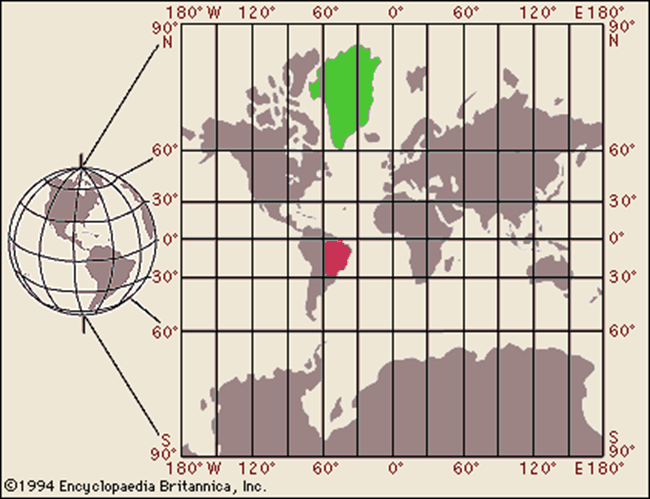
Because Mercator "straightens" the meridians of longitude, making them appear parallel instead of converging at the poles, he needed to mathematically stretch the distance between the parallels of latitude to keep proper relations between two points in the same region and then slice open the resulting cylinder to make a flat surface.  Note how the squares (known as graticules) become rectangular toward the poles.  The distortions are huge and obvious when we hang a map of the world on the classroom wall, but if our object is to make an accurate map for a voyage from, say--Norway to Scotland--they are insignificant :


[Steve's note:  Greenland (green) is mostly between 0˚ and 60˚ W and between 90˚ and 60˚N.  Brazil (red) is between 30˚ and 60˚W and 0˚ and 30˚ S]


On Mercator's Projection, the only place where there is no distortion is along the equator.  The farther you move from it, the greater the distortion.  The traditional comparison is Greenland to Brazil.  Brazil is 2.5 times the size of Greenland, but if you are navigating from Thule to Godthaab, that doesn't matter.

Johann Lambert (1728-1777, an Alsatian) figured out that if instead of creating Mercator's cylinder, you built a cone, it could also touch the surface at some parallel other than the equator and that would be the circle of zero distortion, and by moving the apex of the cone up or down in theoretical space you could choose whatever parallel suited the cartographer's need.  The flattened shape is awkward, but if you are making a series of smaller charts, they can be made in the traditional square or rectangular formats :


Further, Lambert discovered that you could project your cone through the Earth's surface and "touch" at two reference parallels with very little distortion:


You just sort of "tamp down" the bulge of the earth between the "standard parallels" and ignore the very small distortions, as in this example (note the bottom of the legend):


Here's a common use of Lamberts.  The table at the bottom of the legend shows the series of charts, using a variety of "standard parallels" to assure  the minimal distortion.  The lack of distortion in the Lambert projection is especially important for aerial navigation because it permits us to draw a straight line on the chart which is truly represents a great circle on the spherical earth, and great circles are the true path of the radio waves we use to establish positions and courses:


Pedantically yours,

Bill Butler
Professor of Aviation Technology (retired)


PART II - Steve's Questions and Bill's Response

Steve:  Can you explain a little more about the Lambert Charts?  Like, what are they for?  Who uses them? 

Bill:  Actually, they are used for a lot of things, but aircraft navigation may be most common  They come in different scales and with differing levels of detail, but their use is universal, and even with electronic mapping in most airline cockpits, these are the charts which are digitized.  The curved parallels of latitude are a natural outcome of projecting a sphere onto a flat surface, but they are only obvious over a great distance.

Steve:  Why does it say north to the right and south to the left when the map looks like those should be east and west?  Could use a more current one?
 

Bill:  What you are looking at is the cover of an aeronautical chart, where the legend appears explaining what is inside.  "north/south" tells you that this is a two-sided document and if you unfold it from this edge... 

Steve:  Why does it say Seattle, when it has the whole northern part of the US on it?

Bill:    It [the map below] says "San Francisco", for reasons which seem obvious...at least to me [;->  It is one of a set covering the entire nation and the little map shows you what all the others are named.  Note that the Lambert standard parallels for this chart are different than the ones used for the Seattle chart.


Steve:  OK, this is the cover page of your map.  And the little map that is cross hatched - in this case San Francisco - is what is inside this cover.  And in the previous map, I now see that Seattle is also cross-hatched. And thus the north and south designations on the sides would make sense when I opened the map.  Right?

Bill:  Exactly


Bill:  Let me back up a bit to Mercator, who shows that any "great circle" can be projected without distorting it.  He did this mathematically, but graphically, it looks like a sphere within a cylinder.  Note that the when the sphere was inflated to contact all points of the cylinder, only the equator stays exactly where it was, i.e. undistorted.  Now the meridians, while bent, retain their spherical nature, just like the equator.  That is, if you draw a straight line from say Kodiak to Hilo, it is truly the shortest distance and undistorted because they are both on the 150th Meridian, but if you draw a line from Anchorage to Oslo on the map below, even they are both roughly on the 60th Parallel, the track is hugely distorted, because as we both know, the shortest way is over the north tip of Greenland:


This problem can be attacked by what is known as a Transverse  or Oblique Mercator, that is by rotating the sphere within the cylinder so that any line we choose is a "false equator, that is, the line of zero distortion.  This is actually how Pan American attacked the problem when they began flying long overwater routes in the mid-30s; they would make special charts specific to each route and the crew could plot out their course knowing that what was on the paper was the shortest line between two points on a sphere, i.e. a great circle:


This solution is unworkable in a system where tens of thousands of aircraft fly hundreds of routes every day, but Lambert, provides the solution because we can use his theoretical cone (cones, actually, because we choose the one which touches the surface in the zone we are interested in) to map the entire earth with parallels, meridians and course lines drawn to look straight on the flat paper.  This is what the inside of that Seattle aeronautical chart looks like.  I have drawn a line from Portland to Boise in this example:


Notice that the meridians and the parallels appear to be straight (well, the parallel does show a bit of bend, but the error induced is miniscule), although they are segments of a great circle.  Lambert's genius is that the cartographer can select any "standard parallel" for zero distortion, and when he makes the next map to the south or north, choose a different parallel (actually two are used for each chart with acceptable error).

Steve:  Let's see if I got this.  With the original Mercator charts, you're saying, if you just focus on a small portion, even though there is distortion away from the equator, the distortion is the same throughout that small portion, so it's still usable.  Is that right?

Bill:  Almost.  There is a difference between the drawn line and the great circle which truly represents the shortest distance, but an 18th century sailor who was going from Newcastle to Bergen, unless he understood the spherical geometry (unlikely) would be unaware of any error, except it would take him a bit longer than he thought it should.  If he was sailing from Cardiff to Cadiz, there would be almost no error at all because the north-south meridians drawn as straight lines are still great circles.  Generally speaking, these errors were inefficient, but harmless until we started navigating over great distances in short times and using radio to determine courses and positions.

Steve:  And Lambert, by changing the "equator" for each map, clears the distortion that way?

Bill:  Exactly.

And I'm sure Bill would be glad to answer further questions in the comments.

Saturday, August 10, 2013

What Countries Border Syria?


Syria's been in the headlines about two years now, but where is it?  How many of you have pulled out a map and studied this country so that when they say Allepo, you know where it is?  If you've already done this, then hit next blog.  If not, I'm here to remedy that deficit, to help you do what you know you should have done already.

----------------- ----------------- ----------------- ----------------- -----------------
cut here


Cyprus   B 
Turkey
Israel
Lebanon
Egypt
Jordan
Iraq
Syria
Saudi Arabia

----------------- ----------------- ----------------- ----------------- -----------------
cut here


You know if I just gave you a map with the country names, you wouldn't look at it.  But if you take a screen shot from the first cut here line to the next, print it out, and then fill out the table, you'll get this forever.  Below is another map with the names.


From Blog28

And so you can follow the news about what's happening inside Syria, here's a political map with the names of main cities.


This political map comes from a site called World Shia Forum, which has an array of maps showing religious, ethnic, linguistic, population and other characteristics.  The writer of this post proposes dividing up the country on ethnic lines. 


 -

Monday, July 08, 2013

Here's The Map The Redistricting Board Approved Sunday Compared To The Old One

The Alaska Redistricting Board Sunday (July 7, 2013) Approved this Conceptual Map for Alaska.  They were working from the Calista Option 4 map, but then did their own adjustments to different parts.  Jim Holm worked with the Fairbanks area and made changes there.  Anchorage, according to what they said at the meeting yesterday, was left pretty much alone.  (I haven't checked to be sure, though.)

For now I'm going to give you

  1. A comparison of the 2012 Alaska Interim Plan (Amended Proclamation Plan) used for the 2012 election and the map the Board approved in concept Sunday for the 2014 election.
  2. A comparison of the 2012 Anchorage map and the Board's approved concept map for Anchorage.  I also added the Calista Option 4 plan - developed by the Calista Corporation and which the Board used as a starting point.  
I've saved these as pretty big maps so you can double click on them to see them bigger.  But you can also get the PDFs for all these maps and see them in street level detail.

Proposed 2014 Alaska Election Map
2012 Alaska Election Map

Proposed 2014 Anchorage Election Map (Inset in the Alaska map)
2012 Anchorage Election Map

The Two Alaska maps - 2012 election map and the new map for 2014.  (The Board still has to finally adopt this and then it has to survive any court challenges.)


And here's a comparison of the 2012 and proposed 2014 Anchorage maps.  And the Calista Option 4 map that the Board used as a starting point. 


Sorry, Please change 2914 to 2014 and add an 'a' to Calist

 One thing I see that appears to be significant are the Senate pairings.  In 2012 Bettye Davis was put into a new Senate district (M) had an Anchorage house district (25) and an Eagle River house district (26.)  This time it looks like both Eagle River districts are paired to make a Senate seat.  Does this mean that Fred Dyson (R) will be running against Anna Fairclough (R)?  I'm not sure, but it's possible. 

Also, Cathy Geisel's (R) Senate district included a South Anchorage house district  a North Kenai house district.  Now the South Anchorage district is paired with a Muldoon house district.

Those are some obvious changes.  Given how many Republicans are in the Alaska House and Senate, it would be hard to make changes without impacting Republicans. 


Here's the page with the old maps - there are separate maps for different parts of the state in great detail. 
  

Friday, June 28, 2013

Redistricting Board Public Testimony Photos 1 - Beginning And AFFER Maps


Stacks of the plans - there were 11 that were accepted at last weeks meeting.  Then there were three more added as of yesterday.  And then apparently there were a couple more today. 

The audience a little after 10am. 


Randy Ruedrich getting tech help the computer ready for his powerpoint of the AFFER plan.


Larry DeVilbiss, Mayor of Matsu testified along with Randy Ruederich in favor of the AFFER plan. 


AFFER Revised statewide plan.  You can click and enlarge this.


AFFER Revised Anchorage Plan


AFFER Revised Fairbanks Plan

There was strong emphasis by the AFFER folks on how they kept the deviations (in population from one district to another) extremely low.  I think it was 1.44% overall.  This is a good thing in terms of 1 person 1 vote, but since they were allowed up to 10% statewide overall last time, it seems that as long as it's under 4 or 5% over all it should be fine and deviation shouldn't overshadow other issues.  However, I haven't had a chance to look at the plans carefully to see the impact.  And there is no analysis of the maps.  No one has said or been asked how the plans affect incumbents which is really a question that everyone has. 

Saturday, June 22, 2013

Viewing Friday's Redistricting Board Meeting

Some photos of the meeting and after.


After the meeting, Calista attorney Marsha Davis discusses their map with Board attorney Michael White. Carolyn is working with Calista too and has been there most days I've dropped in during the last two weeks. 


I posted my rough notes of the meeting Friday, right after it ended.

Then I added some of the maps Friday night.   The link has links to the other maps I already posted. 


Above, around the table counter clockwise - attorney Michael White, member Marie Green from Kotzebue, Chair John Torgerson, administrator Mary Core, member Jim Holm, and member Bob Brodie.  Member PeggyAnn McConochie was there by phone.


This was by far the most people I've seen at in this room in the last two weeks.  Mostly this was people turning in maps and attorneys or staff of interested organizations.

[For the record, I photoshopped two photos together - I couldn't get everyone in.  It's a little distorted, but it's pretty much what it looked like with Leonard Lawson on the far right, now in the picture.]


Board members Marie Green, John Torgerson, and Jim Holm looking over the Calista map after the meeting.  I think the large Calista map hadn't been printed off yet and posted on the wall.


Some of the audience looking at the Gazewood & Weiner map after the meeting.  G&W is the law firm representing the Riley plaintiffs, the people who filed the suit against the Board.


Maps in one of the Board member's office.  This gives you a little sense of how much the Board has been through.  

Thursday, June 20, 2013

The Other Two Draft Options Since They Aren't On The Redistricting Website Yet [UPDATED WITH LINK TO MAPS]

[UPDATE 4:30pm :  Just an email from the Board:
Due to unforeseen issues with the Redistricting Boards WEB page, we are providing access to the Board unadopted draft plans through Google Drive.

Please click of the following link:


https://drive.google.com/folderview?id=0B23vqYskBnILUjd6V092U2V0clk&usp=sharing
You can get the maps here in all sorts of formats. ]
 [UPDATE 7:00pm:  What the email didn't say is that easier links to the maps, stats, and GIS files are available on the main page here. (June 20 entry if you read this later.)]

Yesterday, a board member asked why I was taking pictures of the plans they had on the wall at the work session, since they were putting them up on their website that afternoon.

"Well, I'll have them up right away and I can direct people to find them on your website, since people won't know that's what your doing.   Nothing's been posted on the Draft Plans page for a long time, so why would they know to look there?  It would help to have an announcement on the home page directing them there."  I was also thinking, "Let's see if your webguy really gets them up today."

Well, I'm pleased to say that announcement is on the home page, but unfortunately, as I write this, almost 24 hours later, none of the draft options are up yet on the website. 

When Taylor Bickford was still working for the Board, he was in charge of the website.  Not much has been done with it since he left.  Though one of the best parts of it have disappeared - mainly the the long list of court documents that made it easy to see all that had been filed by the Board and the various challengers and the Court decisions.

The lack of updates and the missing court documents were noted in Judge McConahy's last order, because the Fairbanks North Star Borough had mentioned them in their amicus brief.  From McConahy's order:
"FNSB contends that the Board is not providing public notice of its meeting in a consistent fashion and is no longer using its website to post court pleadings and has not updated its Facebook page and Twitter accounts since 27 August 2012"
As good as websites and Facebook pages might be, you need to keep them up-to-date and that takes time as this blogger can tell you.

Recently the Board, perhaps in response to the judge's mentioning it, has hired (or contracted or just made an agreement, I'm not sure which) to have Michael Soukup in the Governor's office update the website.

So, until the higher resolutions copies are online, here are the next two - Option E done by tech Ray and Option F done by tech Erin.  (Of course if someone with a little aesthetic sense had thought this through, Erin's would have been Option E.)

Options A, B, and D were posted yesterday here.  I figured I'd get that much up and alert people to check for the others.  But since they still aren't up, I'll post them so you can see them.  [The Draft Plans Drop Down menu is no longer working, which I'll take as a sign that Michael is working on it.]  And close ups of Southeast on all five options were posted here.  Option C had been pulled for more work and they weren't sure if it would be used or not.  


Board Draft Option E


Board Draft Option E - Anchorage


Board Draft Option E - Fairbanks

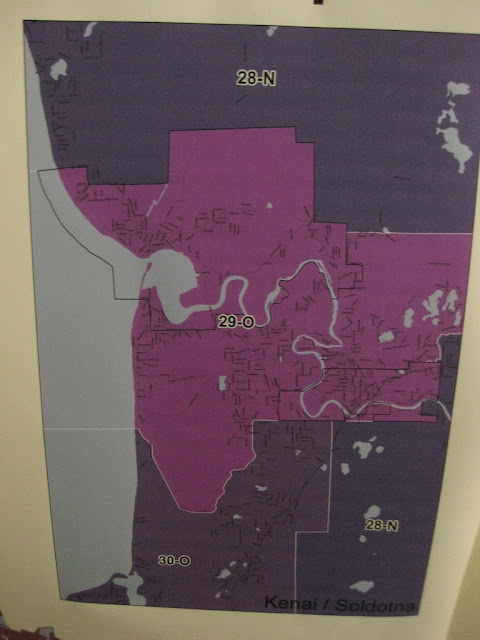
Board Draft Option E - Kenai

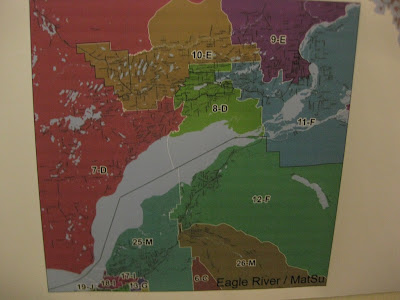
Board Draft Option E - Matsu/ER


Board Draft Option F

Board Draft Option F (Erin)


Board Draft Option F - Anchorage


Board Draft Option F - Fairbanks

Board Draft Option F - Kenai

Board Draft Option F - Matsu/ER

And, as I said above, close ups of Southeast on all five options were posted here.

Wednesday, June 19, 2013

Comparing The Five Southeast Alaska Configurations From The Board

Since I didn't do close ups of Southeast Alaska in the previous post, here they are - plus the two extra maps I didn't get up in the last post.  Again, all five maps - A, B, D, E, and F (yes, no C, for now at least - they are still working on it and it may return) - are scheduled to be up in much better resolution on the Redistricting Board Website in the Draft Plans tab.

Board Draft Option A - Southeast

Board Draft Option B - Southeast

Board Draft Option D - Southeast

Board Draft Option E - Southeast

Board Draft Option F - Southeast
Reminder, Option C was removed, but may return.  They're still working on it. 

Alaska Redistricting Board Has 4 Draft Plans

[UPDATE 4pm - I've added Kenai and Matsu/ER maps for Option A. You can look at closer views of Southeast - in all five options - here.]


The temperature in Anchorage is down a bit today and I decided it was time to visit the Board's work session again.  Board member PeggyAnn McConnochie gave me a weather report (yesterday the main room was 88˚F and one office was over 100˚F) and then a tour of the draft plans on the wall.

There are four draft plans - I took pictures of Plans A, B, C, and D.  But as I'm writing this, plan C has been replaced by Plan E. [UPDATE:  I double checked, C was taken down for more work and may or may not come back]

NOTE:  ALL THESE PLANS ARE SUPPOSED TO BE ON THE BOARD'S WEBSITE SOMETIME THIS AFTERNOON.  THEY SHOULD BE POSTED HERE IN THE DRAFT PLAN TAB.  THESE WILL BE MUCH BETTER RESOLUTION THAN MINE.

These are labeled DRAFT in big letters.  It's what the Board and staff have come up with so far.  From what I can tell, they didn't completely reinvent the wheel and used what they learned the first time around to help them make districts.

I saved these all in a little higher resolution than normal so you can enlarge them, though the light is bad and they aren't great.  You should be able to get much better files on the Board's website soon.

BOARD DRAFT OPTION A - NOT ADOPTED


BOARD DRAFT OPTION A ANCHORAGE


BOARD DRAFT OPTION A - FAIRBANKS

BOARD DRAFT OPTION A - KENAI

BOARD DRAFT OPTION A - MATSU/ER


BOARD DRAFT OPTION B - NOT ADOPTED


BOARD DRAFT OPTION B - ANOCHORAGE


BOARD DRAFT OPTION B -FAIRBANKS


BOARD DRAFT OPTION B - KENAI

BOARD DRAFT OPTION B - MATSU/ER


BOARD DRAFT OPTION D - NOT ADOPTED  [C WAS REMOVED AND REPLACED BY E (RAY'S) AND THEN LATER CAME F [ERIN'S]


BOARD DRAFT OPTION D - ANCHORAGE

BOARD DRAFT OPTION D - FAIRBANKS

BOARD DRAFT OPTION D - MATSU/ER

BOARD DRAFT OPTION D - KENAI


While I was uploading and downloading my photos, they added two more Draft Options - E (Ray's) and F (Erin's).  Ray and Erin are GIS tech's lent to the Board by the Department of Natural Resources.  [Probably good I waited - they've just replaced Option F twice now.]

I also seem to have left out Matsu and Kenai in Option A.  I'll try to add them in.

And, since Southeast didn't have its own little box, I didn't do a closeup of them.  I'll try to repair that oversight too.

And everyone hear assures me that the new person they contracted to keep the website up-to-date will get these all up any time now, so you'll get much better images there. 

And for those who are curious, yes, there's a reason Kenai is larger - it's vertical and I can use Blogger's standard extra-large setting without it running into the sides.  I can play with it in HTML, but I'm trying to get these up quickly.


[UPDATE:  You can look at closer views of Southeast - in all five options - here.]