Sunday, March 22, 2020

Alaska COVID-19 COUNT Sunday March 22 - Up By 8 To 22 [UPDATED, Up to 32 Cases Sunday Night]


What's New?
  1. Updates will be made daily, not just weekdays - this weekend being the first.  This is good since the virus doesn't take the weekends off.
  2. The counts up to now, apparently, were for the data from 11:59pm the day before.  I say 'apparently' because it doesn't tell us when that policy started.
  3. But it's going to change to 5pm postings, it says, but it doesn't tell us what the time frame of those numbers will be.  Obviously not 11:59pm, but when?  And this will mean that comparing days after this starts to days before it starts will be from different time periods.  

All this comes from the top of the first chart posted today (Sunday, March 22, 2020)


They haven't defined 'date of onset.' Previously, I thought the dates were when the person was confirmed positive.  The top says "Laboratory Confirmed Cases." Was I wrong?  Did it change?  There's no explanation.  I thought the addition of the chart above would help us see how the number of confirmed cases grows over time.  That's what it seemed to add to the chart immediately below.  But it's easier to use the chart below to figure out where the confirmed cases are.


From today's chart we learn:
  • Anchorage (pop 292,000)  has six - all travel related cases. 
  • Gulf Coast (pop 81,000) has three - one non-travel.
  • Interior (pop 110,000) has seven - three travel, four not.
  • Southeast (73,000) has six - one travel and five not.
Given that Anchorage is the biggest community by far, perhaps Mayor Berkowitz' early drastic actions (closing most everything from schools to restaurants) may have been a good call.  But it's too early to tell.

[UPDATED 9:56pm:  From Anchorage Daily News:
"Statewide, as of Sunday evening, there were 32 confirmed cases of COVID-19 in Alaska: Seven in Fairbanks; 13 in Anchorage; six in Ketchikan; two in Mat-Su, and one each in Juneau, Sterling, Soldotna and Seward."
That makes 20 new cases since the State reported yesterday.  More than doubled since Saturday.  That's the kind of exponential growth people are talking about and why people need to stay home unless it's absolutely critical.  The link on exponential growth takes you to a video that explains the concept and its application to COVID-19.]

These graphs continue to be frustrating for me.  I like that we can see tests over time.  If you look closely, these are the same two graphs that were posted yesterday.  The numbers are the same and they both end on March 20, 2010.   As I've said before:

[UPDATE Mon March 23, 2020 10:00pm:  The two graphs immediately above were replaced sometime after I did this post with the next day's graphs.  That's good, but it would also be helpful if they mentioned that they did that.  Here are the new ones.  Then I'll post the info that was posted today.

These numbers will be reflected on my chart that I'll post later tonight.]
  1. Ideally these would be interactive and your cursor would show you the numbers for each day
  2. The bottom one would have numbers attached to at least the last day as in the graph above
  3. A third line combining the blue and red lines
  4. I'm still not sure why these distinctions between State labs and commercial labs are important 
  5. The lettering on the charts is going to get smaller and smaller in the next couple of weeks as they try to fit everything in.
MY UPDATED CHART

Given the changes in what the State is offering, keeping parts of my chart current is getting impossible.  There's nothing here to show a change in total tests between today's post and yesterday's.  

The only two columns that I've been able to track consistently are the first [total positive/confirmed] and the third [new positive/confirmed cases].


This is turning out to be one of those projects that grows way beyond the initial post.  I'm hoping I can straighten out the missing and inconsistent numbers tomorrow, if I can get through to the State Department of Health.  I know they're busy, but this seems like a fairly important set of numbers.

I'm sure the reports from other states have their own share of issues.  This all reminds me that any collective number for the US or for any state or any country is just an approximate number.  Meanwhile you can check out Worldometers pages on Corona Virus for a constantly updating count of cases, deaths, and other numbers from around the world.  As of right now (March 22, 2020, 9:11pm Alaska time) they list world wide:

  • Coronavirus Cases:   338,879
  • Deaths:   14,688
  • Recovered:   99,011


Alaska COVID-19 Case Count Sat 3/21/20 Up To 14 Confirmed [8 More Today to 22]

As you can see in the Case Count screen shot below - the State updates these numbers "weekdays by 12:30pm." Except yesterday was a weekend day.  But I did check and they had made an update.  But they didn't tell us if they're now updating daily or not.

New:
This first chart is new and it's welcome.  People can now see, from the state, what region of Alaska they were in.  The color coding is helpful.  BUT this new chart puts up the cases based on "date of onset,"  not when the test confirmed they had COVID-19.   I don't know how they determine 'date of onset."   I'm not a data viz expert, but I find the colors scattered in different places confusing.  One has to stop and count how many from each category.  That's ok now, but won't be soon.  And this chart is going to run out of room soon.  But it's a first start at showing what's happening over time.


The format of next chart seems unchanged from yesterday.  Except there's a new note on top:  Cases Hospitalized.  And eventually, I fear, deaths.  I'd note again, that yesterday they relabeled "Community Contact" as "Non-Travel."  


What's Missing?


  1. Symptoms, circumstances (travel) of those who tested positive.
  2. # of medical provider tests requests turned down by state for testing.   This would show us many other people were found to be credible candidates for a test, but weren't tested.  It's clear this is an issue in Alaska and around the country.  
  3. Reasons tests turned down. My guess here is lack of tests and some sort of triaging that has not been explained well.  
  4. Actual numbers for the "How many people were tested each day?" chart.  Actually, if those charts were interactive so a cursor going along the lines would see the number, that would be great!  Are there data viz people who could volunteer to help the state do these charts better?  Would the state accept the help? 
  5. Definitions of Terms - What exactly does "Travel Related" include?  Out of country only?  Out of state?  Certain states?  What does "Non-Travel" mean?  What about "Date of Onset?"  How do they calculate that?  
  6. Explanations of changes - Why did they replace "Community Contact" with "Non-Travel"?  Why they have introduced new charts - what were they trying to clear up for people?  They previously separated cumulative confirmed from cumulative negative state tests and negative commercial tests.  Now the total tests (distinguished by whether done by State lab or commercial lab) no longer says "negative."  So I have to assume the positives are included there.  
Implications

Which data are presented and how they are presented, AND which data are not presented  reflect what an agency thinks is important, what an agency wants people to see, and what an agency doesn't want people to see.  These decisions might be based on: 
  • very conscious decisions, 
  • not a lot of conscious decision making, or 
  • simply doing the best they can
My thoughts:
  1. The State thinks it's important to
    1. show the number of confirmed cases
    2. show the location of confirmed cases
    3. distinguish between State lab tests and commercial lab tests
    4. show what parts of the state have confirmed cases
  2. The State thinks it's  a) less important,  b) they don't want to call attention to,  c) they aren't keeping track of, d) they're trying to keep the info simple, or e) they don't have the time or skills to offer: 
    1. number of medically recommended tests turned down
    2. reasons why those tests were turned down
    3. whether the positive tests were found in State or commercial labs
MY UPDATED CHART


NEW DATA UP TODAY  - I'll catch up on this later, but here's a quick take

Just as I was finishing this, I double checked to find that the state is now doing daily posts and there's a new one for today - Sunday, March 22. That's good, we need daily reports. But they've changed the format and way they are posting confirmed tests (the top chart with the colored boxes). Also there is the largest jump to date -  it adds 8 new cases for a total of 22 cases.


Saturday, March 21, 2020

Examples Of Being Prepared

The Anchorage Municipal election is April 4.  But no need to postpone this one because it's a mail-in election.  The ballots came by mail and get returned that way.  There will be some drop boxes around town who want to do it that way and there will be some actual voting spots - like the library - if people need to vote on election day.  At least that's how it worked this time.  I suspect there will be a lot more pressure on people to just vote by mail and no need to go out in public spaces.  Because things are going to be a lot worse by April 4 than they are now.


And the Alaska Democratic primary is coming up also.  That too will be by mail.  Plus it will debut ranked choice voting in Alaska.


No need to agonize between your two favorite candidates - you can vote for both of them.  A ballot initiative to change Alaska to ranked choice voting will be on the next statewide ballot.  

When people think ahead and work on how to do it right, communities can move forward to find better ways to do things.  And with the virus right now, having the mail-in vote solves most of the problems we would have had.  


[I started working on a post highlighting the biggest bullshit in the COVID-19 Task Force press conference this morning, but decided we're overdosing on that and something positive was a better choice.  Also my temp dipped down into the mid 97s today - closer to my normal of 96,8 - but it's back up into the 98s.  But that's an improvement.   And my coughing is lessened.  Feel better physically and mentally today. Hope you're all feeling good, self-isolating, and taking advantage of the enforced break.]

Friday, March 20, 2020

Alaska's C0VID-19 Count For Friday March 20, 2020

The State's new post today shows:
  • 3 new positive tests  (two more were reported after the report was posted)
  • New category - 'Community Contact' is now 'Non-Travel'
  • Date was added - wasn't there yesterday


The second part is structured the same as yesterday.  Some observations:
  • The earlier reports distinguished between new positive and new negative tests.  The chart above doesn't show when the positives (confirmed) tests happened, only where.
  • The charts below don't distinguish between the cumulative positive and negative tests or the daily positive or negative tests
  • So, there's no way to figure out how new positive (confirmed) tests are increasing over time, unless you have made screen charts of the previous days' announcements
  • Which is more or less why I started these posts and created my own table to track the daily changes in tests and daily changes in cumulative results
  • The cumulative chart (below) shows a line, but there are only actual numbers on the last day, so you have to estimate for the other numbers
  • The daily tests chart (further below) doesn't even have numbers for the last day, so you have to guess those numbers as well.  You can get reasonably close, but these are numbers they have and we shouldn't have to approximate.  
  • Before yesterday, the reports distinguished between completed confirmed and negative tests.  They don't do that any more.  I'm assuming that the confirmed are now part of the total number of tests given.  
However, today's graphs (below) present a new challenge for me. The numbers don't add up right for me.  I still have a low grade fever and a cough and so maybe I'm just not concentrating hard enough, but this isn't high level math.   
When I use their numbers in the first chart, the cumulative totals 
  • for State Tests (529) plus 
  • the commercial tests (169) 
  • adds up to 698 total tests since they started testing.
Going back to yesterday's post*  we see there were 513 total tests.  So subtracting
  • yesterday's total 513
  • from today's total of 698
  • tells you that there were 185 more tests since yesterday
But when you go down to the next graph and add the numbers it comes out differently
  • the blue line showing number of state tests posted today (for yesterday) we get something close to 75  - we have to guesstimate because the actual number isn't listed
  • and the red line showing the number of commercial tests is just about 55
  • 75+55 = 130
  • which is 55 less than what the top chart (compared to yesterday's posted totals) comes to
  • and even if you add or subtract a few digits because you're guessing off a graph, it's still significant

*(I have to send you to my blog post on this because the state's count page for yesterday has been replaced with today's (Friday) So you can't go back there.  Fortunately I've been posting screenshots.)


I did send an email to the state department of health to see whether I'm missing something, but there's been no response.

But that leaves me with a difficulty in putting the correct numbers in my cumulative chart.  I've done my best.


I understand that the Governor drastically cut state employees last year.  On top of that the people left are struggling with a massive disaster like the state has never seen.  It takes experience and time to figure out the most important numbers to report and how to report them and the state is clearly figuring this out while facing a zillion other tasks.

My intent here originally was to simply document the numbers as they changed day-to-day since that wasn't possible if you just looked at the daily reports (which replaced the previous days' reports.)   I'm doing the best that I can and appreciate any suggestions readers might have to do it better.  Or to let me know if someone else is doing this elsewhere.

https://docs.google.com/spreadsheets/u/2/d/e/2PACX-1vRwAqp96T9sYYq2-i7Tj0pvTf6XVHjDSMIKBdZHXiCGGdNC0ypEU9NbngS8mxea55JuCFuua1MUeOj5/pubhtml#  has been trying to track each state daily, but it would appear that Alaska's changing formats has, for the moment anyway, messed up their scraping system.  The latest they have for Alaska is a total of 6 positive and 402 negative for a total of 408 tests.

If you go to the State tab, you'll see this comment for Alaska:
"Unclear if their reported number means "persons tested" or "specimens tested." We count them as "persons tested" because the header indicates this is the case. Negatives reported on site have decreased at various times in recent hours, without explanation."


"The state [of Alaska] Public Health Laboratories had more than 1600 kits as of Tuesday."

Since I haven't seen this number anywhere, I thought I'd post it now.  It came in an email from Deputy Director, Alaska Division of Public Health Jill Lewis in response to my direct question about how many tests we had.  Last week she'd mention the number 500 tests.  So this time I asked:
"Do you have any updates on the number of tests Alaska has? (The state website has now reported that over 500 tests have been given.)"

So, once again:

"The state Public Health Laboratories had more than 1600 kits as of Tuesday [March 17,2020]."

She didn't mention commercial labs and whether they have additional tests.

Thursday, March 19, 2020

Alaska Keeps Changing How They Report COVID-19 Tests And Results

I've been tracking the COVID-19 tests and results here because I found the state website that posts "Case Counts" was just giving daily snapshots and the previous day's data were replaced with the new data.  So there was no way to see the progression of positive test results or even of how many tests were given out.

So today's report was totally different.  Here's what they've generally looked like:

Then yesterday - above is yesterday - they also added a table.  You can see that in yesterday's post.  

Today this box which summarizes the numbers is GONE.  Now we get this:


And . . .

Having the graph is an improvement to the extent that it shows the number of tests per day, since the beginning.  And from this we learn that they started testing on March 2, 2020.  The previous charts all said on the bottom "Cumulative since 1/1/2020" which didn't make much sense since clearly Alaska wasn't testing in in early January.  Today we see not in February either.  The two graphs make it hard to track the numbers over time precisely.  At least the top one has numbers for the last date.  We don't have that for the bottom chart.  And if these were really professional charts, you'd be able to run the cursor along the red and blue lines and see the number for each date.  These are just images.  
AND the cumulative State and Commercial lab test numbers now include positive tests whereas before they were only negative tests.  Making it impossible to continue my charts based on these charts. (Maybe not, but someone smarter than I am, needs to tell me how.)

Previously, the separated out the tests each day that were positive and negative.  Now you have to go up to the chart and get that information and add and subtract numbers from the graphs to keep regular numbers.  I'm also not sure what the importance of distinguishing between State tests and Corporate tests is.  But someone in the Department of Health thinks it's significant enough to make that distinction.  

And what we don't get here is the chart which shows the progression of positive tests.  We just get the cumulative positives.  (That's in the first chart from today, above.)

Melissa S. Green commented yesterday that in MY table, I ought to switch the columns and rows so they will be easier to read in this format.  It was a great suggestion and I'd been wondering what was going to happen as I got more dates and we moved further to the right.  But how big a job would that be?  Argh.  Google told me quickly that it was no big deal.  (I'm using Apple's Numbers rather than Excel)  Just open the file, click on the whole table, go up to the table tab, then click "Transpose rows and columns."  Done!  

So here's today's updates.  My cough and fever are still festering and so I hope I've gotten all the numbers right.  (subtracting the positives from the cumulatives for negative tests etc. - not hard math, but helps to have a clear head.)


I would note that there were three more positive test results announced this afternoon (after the website was updated.) Two were not immediately related to travel.  In the Governor's press conference this afternoon, I think they said that if these new cases were connected to previously detected cases that were travel related, then they would also be considered travel related.  I don't understand why, unless they just don't want any "community" cases which can't be blamed on people bringing the virus from elsewhere.  If these cases, for example, are listed as travel related, how will cases related to these new ones be classified?  It seems to me that if people who haven't traveled get the virus, then they got it through contact with someone in the community, whether those folks brought it from Outside or not.


[A personal note here.  As I was going through these charts and commenting on them and figuring out ways to improve them, it reminded me very much of reviewing graduate MPA (Masters of Public Administration) student papers, particularly capstone papers.  Our students had to suffer through these kinds of critiques, but most, ultimately said thank you when they could see how much better their papers were.  And this is the kind of written feedback they'd get from me so that they would understand how I thought they could make their papers better.  I hope none of my old students were responsible for these charts.  And I understand how hard it is to make great presentations of information - especially on tight deadlines.  This is really hard stuff to do right.  My sole intent here is  to help Alaskans get the best information they can.]


And thanks Mel.

What Do Evil And Plague Look Like?


Let's start with Evil.  I first learned Alex Gibney's name when Taxi To The Dark Side played at the 2006 Anchorage International Film Festival.  The story of the Afghan taxi driver who ends up tortured and dying in Baghram Air Force Base.  It was powerful and my favorite doc that year and probably my favorite film overall.  And it went on to win an Oscar for best feature documentary.  Gibney has made a lot of films since then.

Netflix has Slumloard Millionaire up now, a look at Jared Kushner's real estate world.  One section of the film looks at how Kushner bought rent controlled apartment buildings in NYC and then practiced all sorts of harassment techniques to get renters out - ceilings fall in from floods above, jackhammers all night, nothing repaired, toxic materials, etc.

Then there's the story of 666 Fifth Avenue which Kushner bought when prices were sky-high, just before the 2008 crash.  And how he then had to scramble to find money to pay his debts.  Among the schemes was squeezing low income tenants in his various buildings - and the film particularly focuses on the Baltimore area.  There are late fees, tacked onto rent that get deducted so that the renter hasn't paid the full rent which allows for more fees the next month.  Meanwhile the renter doesn't know any of this is happening and just keeps paying the regular rent and falling further behind. While this nickle-and-diming can't raise what Kushner needs, over thousands of tenants it adds up.  A reporter walks the neighborhood and shows us all the doors with shaming notices prominently taped onto people's door.  Then there's the lady who has complained about the lack of repairs in her apartment and gotten a signed waiver to leave her lease.  Three years later she starts getting notices from JKSomethingLLC.  She has no idea who that is.  They are demanding $3000 for cutting out on her lease three years ago. She no longer has the waiver, she never thought she'd still need it.  Fortunately, an investigative reporter finds her and writes about her.  That gets her an attorney who locates the housing records that prove her allegation she left legally.  And JK suddenly and magnanimously agrees to drop the bill.

This is just evil.  And this is one of the key people advising the president.   Some even say he's running a shadow coronavirus task force made up of business leaders.  But we don't get daily reports from them.  The behavior highlighted in the movie is fair warning for Kushner's task force is to help him and business campaign supporters figure out how to siphon off as much of the money earmarked to fight Coronavirus as possible.  helps himself and his father-in-law to every spare dollar they can get off the government.    Trump even referred to the head of Carnival Cruises today as his friend Micky who is offering cruise ships for non-COVID-19 hospitals.  I'm sure 'offering' as in I'll only charge twice what I would make if all my ships weren't sitting idle now.  (I'd note that Carnival owns Princess Lines.)


Now let's switch to Plague.  Here's a paragraph from an article by Jennifer Cooke, a plague expert.  She wrote her dissertation on the Bubonic Plague and then converted it to a book.  She writes about how she hadn't expected to experience one.
"What can I tell you about contagious epidemics? What will happen to us? Soon, we will see people scared of one another. Soon, a celebrity with COVID-19 will die. Soon, infected houses will display a sign warning delivery drivers and neighbours. Or non-infected houses will, attempting to reassure. Soon, there will be pets without owners, newly made strays fending for themselves. The most vulnerable will suffer even more. Domestic violence rates will sky-rocket. We will see armed forces patrol the streets. We will tell each other incredible stories we have heard of cruelty, of misery, but also of heroism, of generosity. There will be social unrest. There will be cult weirdos and strange beliefs, doomsters baying about the end of times. There will be exploiters, quacks, and fraudsters. But there will also be simple kindnesses, more phone calls between family members, between friends. We will all work less, if at all. There will be absurdity. And there will be incredible community support, for the people by the people. There will be ingenious new forms of entertainment and the revival of older forms that we have forgotten or stashed at the back of the cupboard. There will be incredible boredom and a lot of cleaning. This is what my knowledge tells me."
There's lots more there.  She also gets into Daniel Defoe's book on the plague, which ADN write Michael Carey also wrote about today.   There's also a link to the original Journal of The Plague Year for people who want a preview of what's coming.  (Times are different.  Science plays a bigger role now, but we still have many religious charlatans who use calamity to their advantage.  (As I recall, every natural disaster during he Obama years was a sign from God.  I don't see that so much not that the charlatan in chief is in office.)


Wednesday, March 18, 2020

Alaska COVID-19 Update 3 More Positives For A Total Of 6 Since Friday [Updated With COVID-19 Video Showing Progression of V]

NOTE:  Today's update says it was updated yesterday at 7pm instead of today at 12:30pm, so these added numbers don't reflect 24 hours since the last posting.


This chart and the one at the bottom from here.
[UPDATED March 18, 2020 8:20pm:  Since the announcement above is listed as being posted at 7pm on March 17, and there was no new one today when I looked after today's scheduled post - I used it and assume it would cover for today.  But since yesterday's was posted at 7pm, I thought I'd check.  And sure enough there's a new update from 12:30pm today.  I checked and I got mine at 12:43pm so there's might have been posted shortly after that.  It looks pretty much the same.


Maybe that just had the wrong time stamp on it and fixed it.  But it's really helpful to notify readers why you made a change - in this case the date and time have been changed.

Meanwhile, three more cases have been reported in the news today.  Based on the video below and other writers, I'm expecting the number of positives to jump pretty quickly in the next week or two.]

In the last few days we've gone from 0 positives, to 1 positive, to 3, then to 6.  Since only a tiny percent of our population has been tested, I expect that numbers will start to go up quickly once testing is more widespread.  Meanwhile people are out and about without knowing if they are positive or negative.

I saw a distinction yesterday between diagnostic testing (to determine a patient's treatment) and surveillance testing (to keep track of the overall spread of the virus in the community.)  It seems to me that Alaska has focused on diagnostic testing.

Here's my update from the numbers I put up yesterday.  I'm trying to track this on a continuous basis so people can see the daily and weekly increases in people tested and results.  As I do these, only the last column should change each day.  I'd note again, that 'today's' posting says it was posted yesterday at 7pm.  (The notice has said everyday they'll post at 12:30pm daily weekdays).  So, technically, there are two posting from yesterday, so the increase is only up to 7pm yesterday.  And the increase is more for half a day.


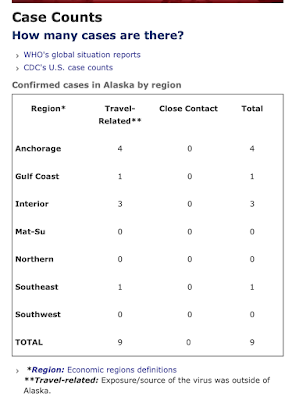
This report also had a new chart attached to it that gives overall numbers.

Region*
Travel-Related**
Close Contact
Total
 Anchorage
2
 0
2
 Gulf Coast
0
 0
0
 Interior
3
 0
3
 Mat-Su
0
 0
0
 Northern
0
 0
0
 Southeast
1
 0
1
 Southwest
0
 0
0
 TOTAL
6
0
6
**Exposure/source of the virus was outside of Alaska.


You'll see the state is perhaps trying to console us by pointing out that all the cases are people who traveled and brought the virus back to Alaska.  But we don't know how many people they interacted with before they were tested and isolated.


[UPDATE 5:44pm]

The video below does a good job of showing (based on Wuhan data) how many actual cases there are compared to the identified cases, for various reasons.  One could argue this doesn't apply so well to us here in Alaska because, so far, the cases were brought in from Outside.  (All the more reason to be screening passengers on Alaska bound jets.  Our geographic isolation makes it relatively easier to check on people entering the state.)  But as people bring the virus in and spread it before getting sick, we're going to see similar dynamics.


Did Health Experts Show These Predictions To Trump? Imperial College Report Summary

[You have to click on the embedded tweet below yo see the whole thread.  When you get to the original's Tweet, click on show thread.]

]
Trump seems to be taking COVID-19 more seriously - or at least how his response may reflect on him.  This Twitter thread summarizes the findings of the Imperial College predictions - if we do nothing, if we take moderate precautions, if we go to total self-isolation.

Many of us may not be here next year.


Tuesday, March 17, 2020

2 More Positive Alaska Tests - Trying To Track COVID-19 In Alaska

The state COVID-19 page replaces yesterday's data with today's data.  So unless you've been screen-saving or otherwise saving the data each day, there's no real way I've found to keep track of things.  So in this post I'm adding a table that allows you to see testing numbers and results over time.

But first, today's report:


Two new confirmed cases showed up in Fairbanks.  According to the State 334 people have been tested.  I have not been able to get an answer to the question:  how many tests does Alaska have and how many do we expect to have soon?   The original number that was bandied about was 500.  We're 166 shy of that number.  It's not clear why people are being cagey about numbers of available tests.

Anyway, here's my first stab at tracking the tests:


Is everyone who should be tested getting tested?  This Tweet suggests that access to doctors and cost is a factor that might be limiting who gets tested.