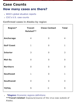
So today's report was totally different. Here's what they've generally looked like:
Then yesterday - above is yesterday - they also added a table. You can see that in yesterday's post.
Today this box which summarizes the numbers is GONE. Now we get this:
Having the graph is an improvement to the extent that it shows the number of tests per day, since the beginning. And from this we learn that they started testing on March 2, 2020. The previous charts all said on the bottom "Cumulative since 1/1/2020" which didn't make much sense since clearly Alaska wasn't testing in in early January. Today we see not in February either. The two graphs make it hard to track the numbers over time precisely. At least the top one has numbers for the last date. We don't have that for the bottom chart. And if these were really professional charts, you'd be able to run the cursor along the red and blue lines and see the number for each date. These are just images.
AND the cumulative State and Commercial lab test numbers now include positive tests whereas before they were only negative tests. Making it impossible to continue my charts based on these charts. (Maybe not, but someone smarter than I am, needs to tell me how.)
Previously, the separated out the tests each day that were positive and negative. Now you have to go up to the chart and get that information and add and subtract numbers from the graphs to keep regular numbers. I'm also not sure what the importance of distinguishing between State tests and Corporate tests is. But someone in the Department of Health thinks it's significant enough to make that distinction.
And what we don't get here is the chart which shows the progression of positive tests. We just get the cumulative positives. (That's in the first chart from today, above.)
Melissa S. Green commented yesterday that in MY table, I ought to switch the columns and rows so they will be easier to read in this format. It was a great suggestion and I'd been wondering what was going to happen as I got more dates and we moved further to the right. But how big a job would that be? Argh. Google told me quickly that it was no big deal. (I'm using Apple's Numbers rather than Excel) Just open the file, click on the whole table, go up to the table tab, then click "Transpose rows and columns." Done!
So here's today's updates. My cough and fever are still festering and so I hope I've gotten all the numbers right. (subtracting the positives from the cumulatives for negative tests etc. - not hard math, but helps to have a clear head.)
Alaska Covid-19 Data by Steve on Scribd
I would note that there were three more positive test results announced this afternoon (after the website was updated.) Two were not immediately related to travel. In the Governor's press conference this afternoon, I think they said that if these new cases were connected to previously detected cases that were travel related, then they would also be considered travel related. I don't understand why, unless they just don't want any "community" cases which can't be blamed on people bringing the virus from elsewhere. If these cases, for example, are listed as travel related, how will cases related to these new ones be classified? It seems to me that if people who haven't traveled get the virus, then they got it through contact with someone in the community, whether those folks brought it from Outside or not.
[A personal note here. As I was going through these charts and commenting on them and figuring out ways to improve them, it reminded me very much of reviewing graduate MPA (Masters of Public Administration) student papers, particularly capstone papers. Our students had to suffer through these kinds of critiques, but most, ultimately said thank you when they could see how much better their papers were. And this is the kind of written feedback they'd get from me so that they would understand how I thought they could make their papers better. I hope none of my old students were responsible for these charts. And I understand how hard it is to make great presentations of information - especially on tight deadlines. This is really hard stuff to do right. My sole intent here is to help Alaskans get the best information they can.]
And thanks Mel.


