Former Alaskan and aviation faculty member and a pilot, Bill Butler, offered some followup info and images to my Earth Null School post. I asked if I could post his email as a guest post. He graciously agreed. So here's a little more on this topic, which because it deals very visually with distortions of "how we know," is very dear to this blog's underlying theme.
I'm told, that geography isn't taught much in school these days. My sense is that there are people who really, really know this stuff, people like me who sort of know it, and then most other people who don't have a clue.
With GPS people don't even need to read maps at all any more. But understanding this helps us understand other geo-political issues. Plus maps are a good metaphor for other representations of reality that aren't as tangible - like words and theories. And this issue about Mercator projections and how they distort size is certainly important to Alaskans. (Relax, even after undistorting us, we're still bigger than Texas.)
So, for those of you for whom this is a stretch, I invite you to do a little mental yoga. I'm also trying to use parts of my brain that usually don't have to move at all. And so, you'll see at the end of this post, my questions to Bill, and his further response.
Part I - Bill's Guest Post
Because Mercator "straightens" the meridians of longitude, making them appear parallel instead of converging at the poles, he needed to mathematically stretch the distance between the parallels of latitude to keep proper relations between two points in the same region and then slice open the resulting cylinder to make a flat surface. Note how the squares (known as graticules) become rectangular toward the poles. The distortions are huge and obvious when we hang a map of the world on the classroom wall, but if our object is to make an accurate map for a voyage from, say--Norway to Scotland--they are insignificant :
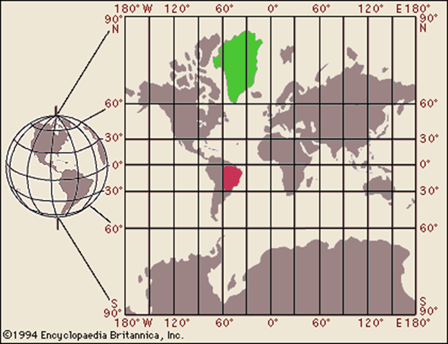
[Steve's note: Greenland (green) is mostly between 0˚ and 60˚ W and between 90˚ and 60˚N. Brazil (red) is between 30˚ and 60˚W and 0˚ and 30˚ S]
On Mercator's Projection, the only place where there is no distortion is along the equator. The farther you move from it, the greater the distortion. The traditional comparison is Greenland to Brazil. Brazil is 2.5 times the size of Greenland, but if you are navigating from Thule to Godthaab, that doesn't matter.
Johann Lambert (1728-1777, an Alsatian) figured out that if instead of creating Mercator's cylinder, you built a cone, it could also touch the surface at some parallel other than the equator and that would be the circle of zero distortion, and by moving the apex of the cone up or down in theoretical space you could choose whatever parallel suited the cartographer's need. The flattened shape is awkward, but if you are making a series of smaller charts, they can be made in the traditional square or rectangular formats :

Further, Lambert discovered that you could project your cone through the Earth's surface and "touch" at two reference parallels with very little distortion:

You just sort of "tamp down" the bulge of the earth between the "standard parallels" and ignore the very small distortions, as in this example (note the bottom of the legend):

Here's a common use of Lamberts. The table at the bottom of the legend shows the series of charts, using a variety of "standard parallels" to assure the minimal distortion. The lack of distortion in the Lambert projection is especially important for aerial navigation because it permits us to draw a straight line on the chart which is truly represents a great circle on the spherical earth, and great circles are the true path of the radio waves we use to establish positions and courses:

Pedantically yours,
Bill Butler
Professor of Aviation Technology (retired)
PART II - Steve's Questions and Bill's Response
Steve: Can you explain a little more about the Lambert Charts? Like, what are they for? Who uses them?
Bill: Actually, they are used for a lot of things, but aircraft navigation may be most common They come in different scales and with differing levels of detail, but their use is universal, and even with electronic mapping in most airline cockpits, these are the charts which are digitized. The curved parallels of latitude are a natural outcome of projecting a sphere onto a flat surface, but they are only obvious over a great distance.
Steve: Why does it say north to the right and south to the left when the map looks like those should be east and west? Could use a more current one?
Bill: What you are looking at is the cover of an aeronautical chart, where the legend appears explaining what is inside. "north/south" tells you that this is a two-sided document and if you unfold it from this edge...
Steve: Why does it say Seattle, when it has the whole northern part of the US on it?
Bill: It [the map below] says "San Francisco", for reasons which seem obvious...at least to me [;-> It is one of a set covering the entire nation and the little map shows you what all the others are named. Note that the Lambert standard parallels for this chart are different than the ones used for the Seattle chart.

Steve: OK, this is the cover page of your map. And the little map that is cross hatched - in this case San Francisco - is what is inside this cover. And in the previous map, I now see that Seattle is also cross-hatched. And thus the north and south designations on the sides would make sense when I opened the map. Right?
Bill: Exactly
Bill: Let me back up a bit to Mercator, who shows that any "great circle" can be projected without distorting it. He did this mathematically, but graphically, it looks like a sphere within a cylinder. Note that the when the sphere was inflated to contact all points of the cylinder, only the equator stays exactly where it was, i.e. undistorted. Now the meridians, while bent, retain their spherical nature, just like the equator. That is, if you draw a straight line from say Kodiak to Hilo, it is truly the shortest distance and undistorted because they are both on the 150th Meridian, but if you draw a line from Anchorage to Oslo on the map below, even they are both roughly on the 60th Parallel, the track is hugely distorted, because as we both know, the shortest way is over the north tip of Greenland:

This problem can be attacked by what is known as a Transverse or Oblique Mercator, that is by rotating the sphere within the cylinder so that any line we choose is a "false equator, that is, the line of zero distortion. This is actually how Pan American attacked the problem when they began flying long overwater routes in the mid-30s; they would make special charts specific to each route and the crew could plot out their course knowing that what was on the paper was the shortest line between two points on a sphere, i.e. a great circle:

This solution is unworkable in a system where tens of thousands of aircraft fly hundreds of routes every day, but Lambert, provides the solution because we can use his theoretical cone (cones, actually, because we choose the one which touches the surface in the zone we are interested in) to map the entire earth with parallels, meridians and course lines drawn to look straight on the flat paper. This is what the inside of that Seattle aeronautical chart looks like. I have drawn a line from Portland to Boise in this example:

Notice that the meridians and the parallels appear to be straight (well, the parallel does show a bit of bend, but the error induced is miniscule), although they are segments of a great circle. Lambert's genius is that the cartographer can select any "standard parallel" for zero distortion, and when he makes the next map to the south or north, choose a different parallel (actually two are used for each chart with acceptable error).
Steve: Let's see if I got this. With the original Mercator charts, you're saying, if you just focus on a small portion, even though there is distortion away from the equator, the distortion is the same throughout that small portion, so it's still usable. Is that right?
Bill: Almost. There is a difference between the drawn line and the great circle which truly represents the shortest distance, but an 18th century sailor who was going from Newcastle to Bergen, unless he understood the spherical geometry (unlikely) would be unaware of any error, except it would take him a bit longer than he thought it should. If he was sailing from Cardiff to Cadiz, there would be almost no error at all because the north-south meridians drawn as straight lines are still great circles. Generally speaking, these errors were inefficient, but harmless until we started navigating over great distances in short times and using radio to determine courses and positions.
Steve: And Lambert, by changing the "equator" for each map, clears the distortion that way?
Bill: Exactly.
And I'm sure Bill would be glad to answer further questions in the comments.
I'm unsure if anyone else is experiencing the same difficulty I am.
ReplyDeleteFor me, I'm only able to view the first image, all others have repeatedly failed to load.
?
Thanks for the heads up Joe Blow. The pics work on my laptop where I originally checked them. After your comment I checked on my iPod Touch and they didn't work there. I think I know the problem - I simply copied everything from Bill's email and pasted it into the blog post. Except the first picture which I had to play with to make the colors for Greenland and Brazil. I could go back and redo all the images, but not this morning.
DeleteAre only people on mobile devices having problems? Are all folks on mobiles having problems? Are others also having the same problems?
All images loading on my MacBook, from the start.
DeleteWhatever you changed did the trick, thanks, I hadn't previously tried any mobile devices.
ReplyDeleteIt was my MacBook Pro that wouldn't load images yesterday, this morning they loaded just fine.
And having the images makes all the difference, I don't know if I've seen a post that was more difficult to follow along without the images.
Thanks for letting me know about the problem in the first place. It wasn't too much trouble to fix. I just had to save all the images on my computer and load them they normal way. And yes, the pictures are essential to understanding this.
ReplyDeleteThank you and thanks to Bill for an intriguing discussion. I had never heard of Lambert projections. Just one reason why I love your blog.
ReplyDeleteI was a geography geek from sixth grade on, back when there were hardly any independent countries in Africa. I have tried to keep up with the changing names of countries and capitals but what you learned at age 11 is so much more lasting than what you add later!